

Parametry
- 496 stron
- 18 godzin czytania
Więcej o książce
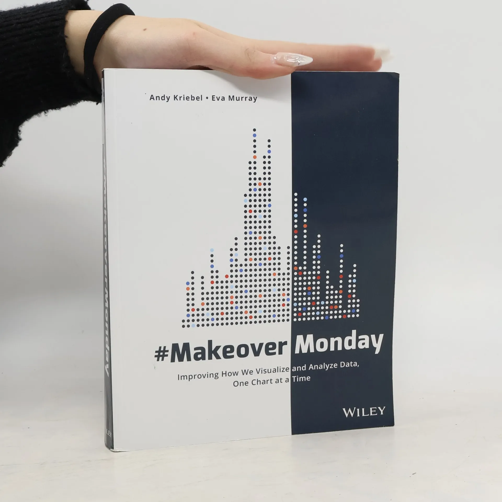
Explore different perspectives and approaches to create more effective visualizations. #MakeoverMonday offers inspiration for those who communicate data. Initially a small project in the data visualization community, it features a weekly chart or graph alongside a dataset that community members reimagine for greater effectiveness. The results are remarkable; hundreds have contributed thousands of makeovers, highlighting the diverse nature of data visualization. Various interpretations of the same data reveal significant differences in theme, focus, content, and design, with side-by-side comparisons showcasing effective and ineffective techniques. This book extends that project, presenting a variety of makeovers that emphasize analytical, design, and storytelling skills honed through #MakeoverMonday. Browsing through these makeovers sparks inspiration for your own work, offers insights into different viewpoints, and underscores impactful techniques. It encourages exploration of visual data communication, consideration of audience and message, intuitive graph design, and assessment of layout, color, font, and chart type. Creating visual representations of complex datasets is challenging, balancing the need for clarity with the desire for artistic flair. #MakeoverMonday illustrates how to navigate between straightforward reporting and design artistry to produce the most suitable visualizations for any situation.
Zakup książki
#MakeoverMonday, Andy Kriebel, Eva Murray
- Język

- Rok wydania
- 2018
- Oprawa
- (miękka)
Metody płatności
Brakuje nam tutaj Twojej recenzji.
- Tytuł
- #MakeoverMonday
- Podtytuł
- Improving How We Visualize and Analyze Data, One Chart at a Time
- Język
- angielski
- Autorzy
- Andy Kriebel, Eva Murray
- Wydawca
- WILEY
- Rok wydania
- 2018
- Oprawa
- miękka
- Liczba stron
- 496
- ISBN10
- 1119510775
- ISBN13
- 9781119510772
- Seria
- Kategorie
- Ocena
- 4,4 z 5
- Opis
- Explore different perspectives and approaches to create more effective visualizations. #MakeoverMonday offers inspiration for those who communicate data. Initially a small project in the data visualization community, it features a weekly chart or graph alongside a dataset that community members reimagine for greater effectiveness. The results are remarkable; hundreds have contributed thousands of makeovers, highlighting the diverse nature of data visualization. Various interpretations of the same data reveal significant differences in theme, focus, content, and design, with side-by-side comparisons showcasing effective and ineffective techniques. This book extends that project, presenting a variety of makeovers that emphasize analytical, design, and storytelling skills honed through #MakeoverMonday. Browsing through these makeovers sparks inspiration for your own work, offers insights into different viewpoints, and underscores impactful techniques. It encourages exploration of visual data communication, consideration of audience and message, intuitive graph design, and assessment of layout, color, font, and chart type. Creating visual representations of complex datasets is challenging, balancing the need for clarity with the desire for artistic flair. #MakeoverMonday illustrates how to navigate between straightforward reporting and design artistry to produce the most suitable visualizations for any situation.