

Więcej o książce
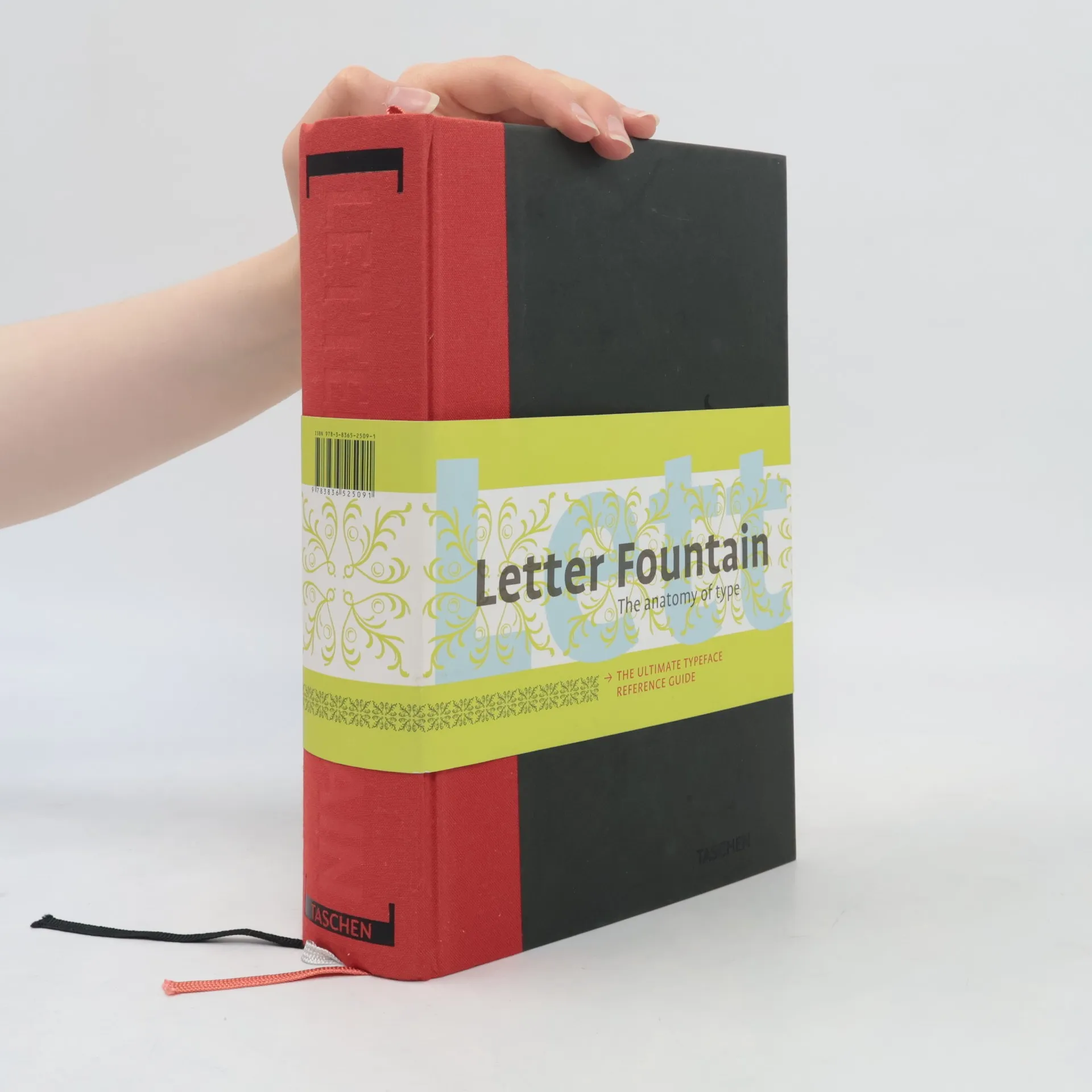
This comprehensive typeface handbook explores the evolution of letterforms and their significance in visual communication, tracing back to humanity's earliest signs and drawings. It meticulously examines the anatomy of each letter, punctuation marks, and special characters, while cross-referencing type designs with significant artworks and movements from Gutenberg's era to the present. The book addresses the aesthetics of the digital age and provides guidance on selecting the appropriate typeface for various projects. It includes a detailed comparison of sans-serif and serif typefaces, an essay on measurement systems, typographic rules, and a manual for creating digital fonts. Over 150 typefaces are analyzed, with full-page tables illustrating scale, weight, and slope increments. The extensive appendix features a general index, a typeface index with over 300 entries, an index of more than 250 type designers, a comprehensive list of type founders from Gutenberg onward, a graphical dictionary, and a bibliography for further exploration. The original Dutch edition received accolades for typographic excellence and design. Special features include a hardbound cover with three ribbon bookmarks, a 144-page appendix with a glossary and indices, and a typographic ruler with conversions and shortcuts for Apple keyboards.


Zakup książki
Letter Fountain, Joep Pohlen, Geert Setola
- Język

- Rok wydania
- 2011
- Oprawa
- (twarda)
Metody płatności
Nikt jeszcze nie ocenił.
- Tytuł
- Letter Fountain
- Podtytuł
- On Printing Types
- Język
- angielski
- Autorzy
- Joep Pohlen, Geert Setola
- Wydawca
- Taschen
- Rok wydania
- 2011
- Oprawa
- twarda
- Liczba stron
- 640
- ISBN10
- 3836525097
- ISBN13
- 9783836525091
- Seria
- Tagi
- Sztuka
- Opis
- This comprehensive typeface handbook explores the evolution of letterforms and their significance in visual communication, tracing back to humanity's earliest signs and drawings. It meticulously examines the anatomy of each letter, punctuation marks, and special characters, while cross-referencing type designs with significant artworks and movements from Gutenberg's era to the present. The book addresses the aesthetics of the digital age and provides guidance on selecting the appropriate typeface for various projects. It includes a detailed comparison of sans-serif and serif typefaces, an essay on measurement systems, typographic rules, and a manual for creating digital fonts. Over 150 typefaces are analyzed, with full-page tables illustrating scale, weight, and slope increments. The extensive appendix features a general index, a typeface index with over 300 entries, an index of more than 250 type designers, a comprehensive list of type founders from Gutenberg onward, a graphical dictionary, and a bibliography for further exploration. The original Dutch edition received accolades for typographic excellence and design. Special features include a hardbound cover with three ribbon bookmarks, a 144-page appendix with a glossary and indices, and a typographic ruler with conversions and shortcuts for Apple keyboards.